vernissage
poster
the brief
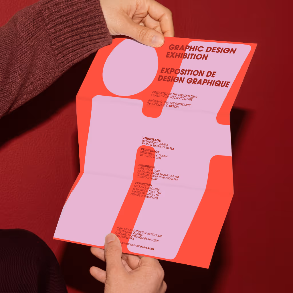
The vernissage poster was created to represent the graduating graphic design class of 2026. Each student was asked to design a poster that captures the spirit of the group—three years of learning, experimenting, collaborating, and growing together as designers.
Rather than focusing on individual work, the goal was to express the collective identity of the class. What defines us after three years in the program? What feeling represents the energy, confidence, and creativity we’re leaving with?
the proccess
The process began with exploration. I tested many different concepts, searching for the strongest way to represent our class as a whole. After nearly ten different ideas and iterations, it became clear that the solution wasn’t about complex visuals—it was about finding the right word.
Through conversations with classmates and guidance from our teacher, one word finally stood out

the solution
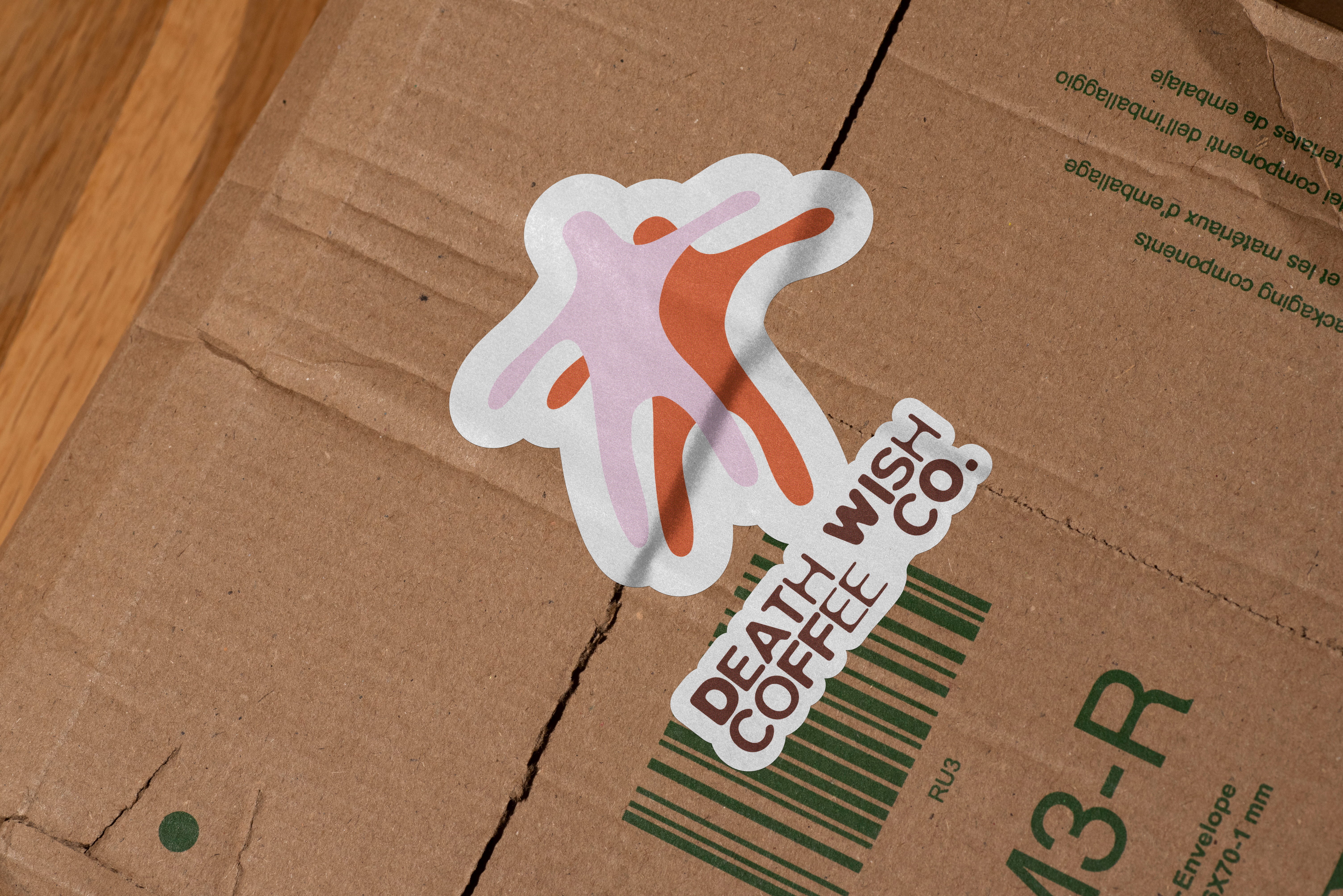
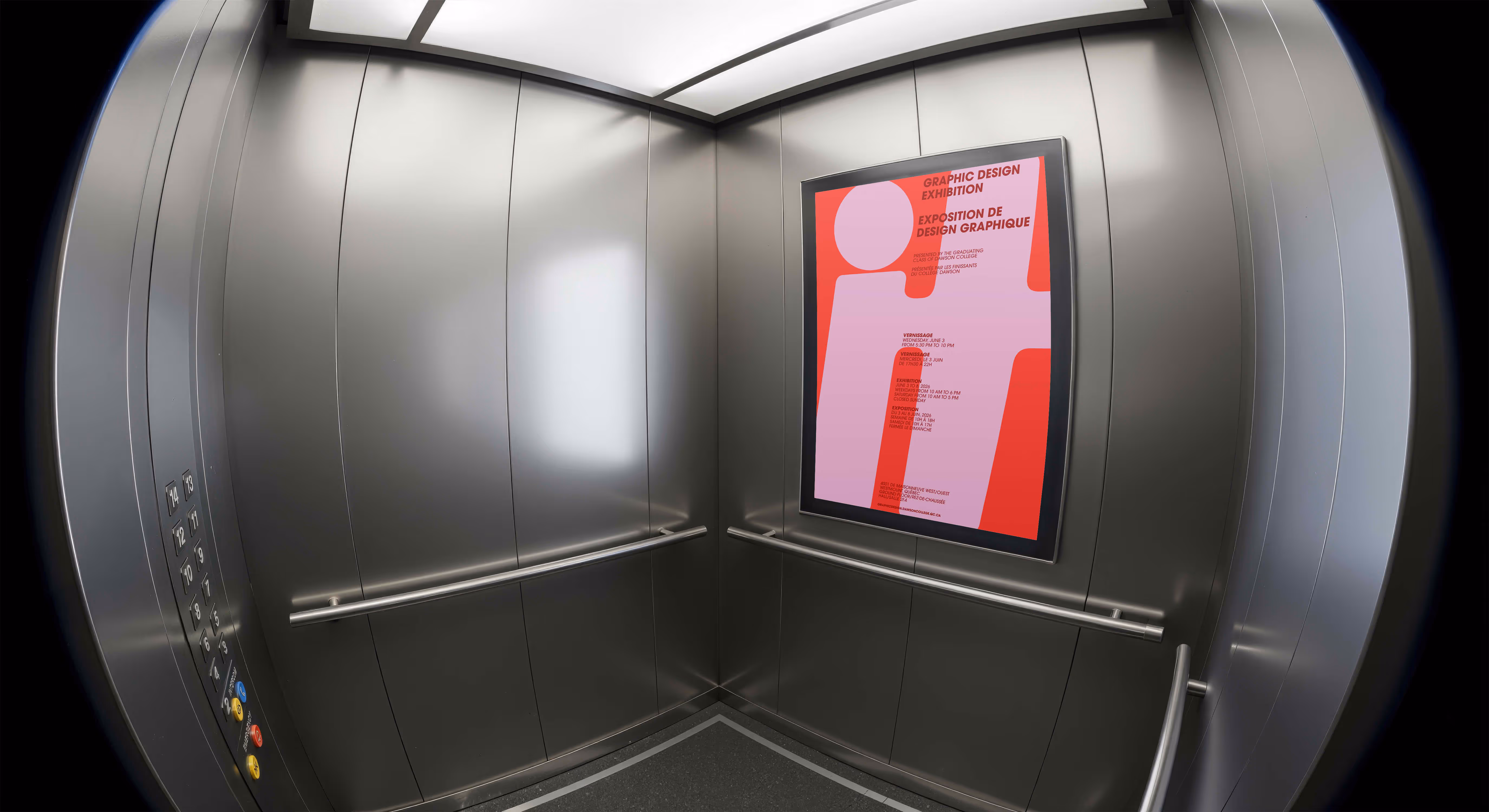
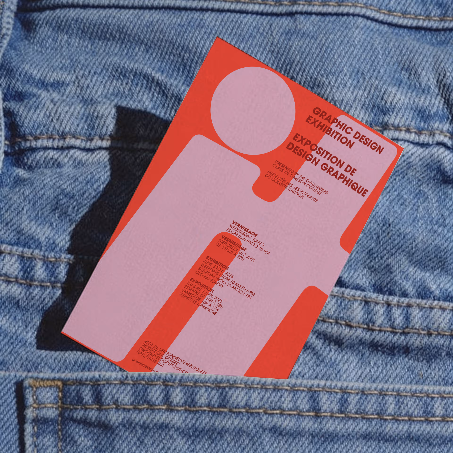
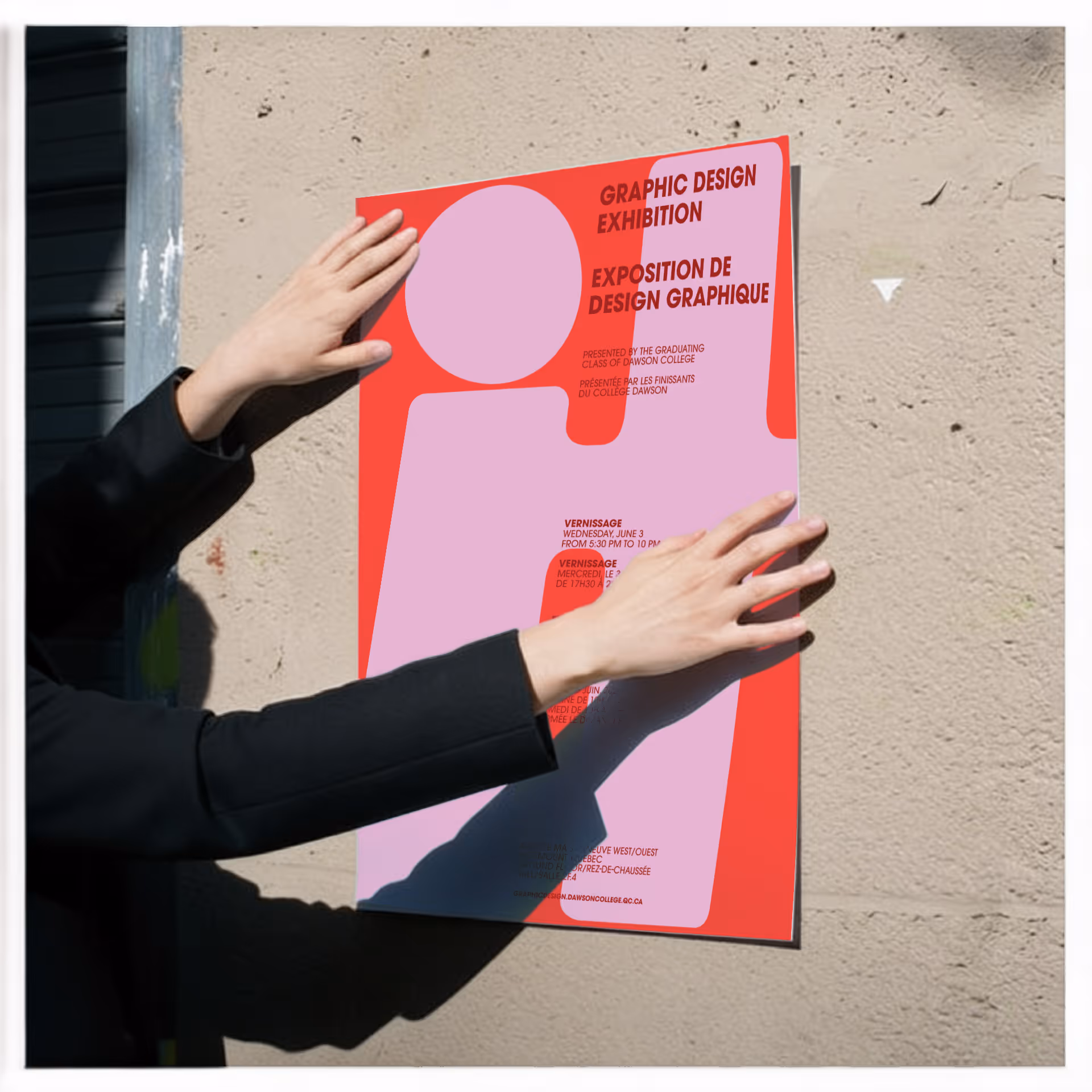
The final poster centers on the word “It”—simple, bold, and confident. Bright, eye-catching colors draw attention from passersby, inviting them to stop and take a closer look.
Short, confident, and open to interpretation, the word captured exactly how our class felt. We are it. The ones finishing the program, the ones ready to step forward, the ones who have spent three years building the skills and confidence to move into the design world.
The typography draws inspiration from movie credits rolling at the end of a film. This visual reference reflects the journey we’ve just completed—three years of shared experiences, late nights, and creative growth coming to their final scene.
The credit-like typography quietly nods to the story behind the poster: the full three years we spent learning and creating together. What appears simple at first glance carries a deeper meaning, summarizing the identity of our graduating class in a single word.
In the end, the design proves that sometimes the strongest message is also the simplest. One word was enough to capture the spirit of an entire class.