bumble campaign
the breief
Bumble, the dating app, turns everyday swipes into meaningful moments, creating a space where connections of all kinds can spark and grow. More than just a dating app, Bumble brings people together romantically, professionally, and socially—through Bumble Date, Bumble Bizz, and Bumble BFF.
Each space offers something distinct. Bumble Date opens the door to chemistry and shared experiences. Bumble Bizzcreates room for ambition and collaboration. Bumble BFF makes it easier to find your people—the ones who show up, ride along, and stay awhile.
This project celebrates connection in its many forms. Our goal was to creat a campaign set out to shine a light on all three sides of the Bumble world, giving each its own personality while keeping them united under one bright, welcoming voice. The idea was simple and relatable: there’s something special about finally finding someone to share it with—whatever it may be.

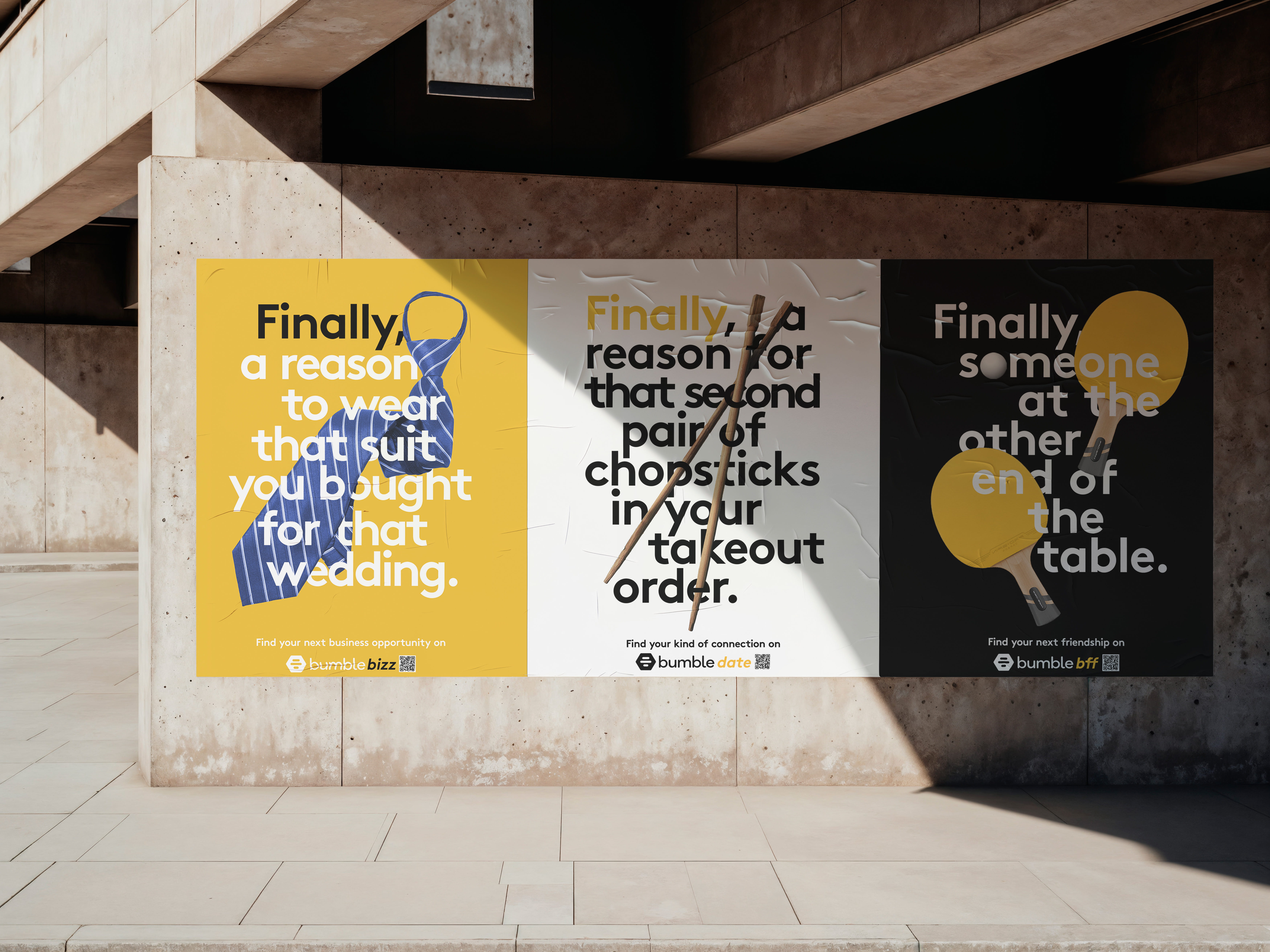
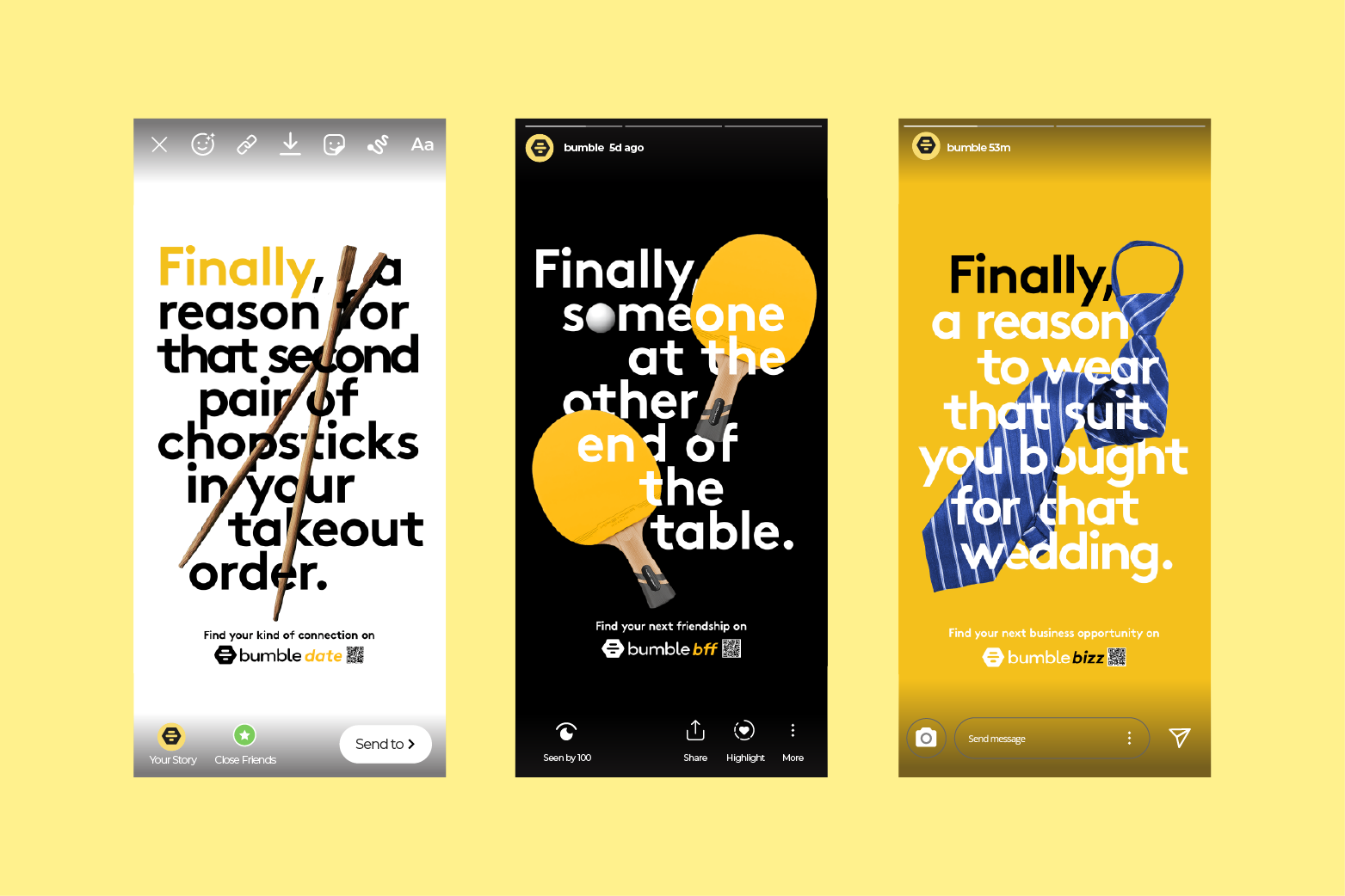
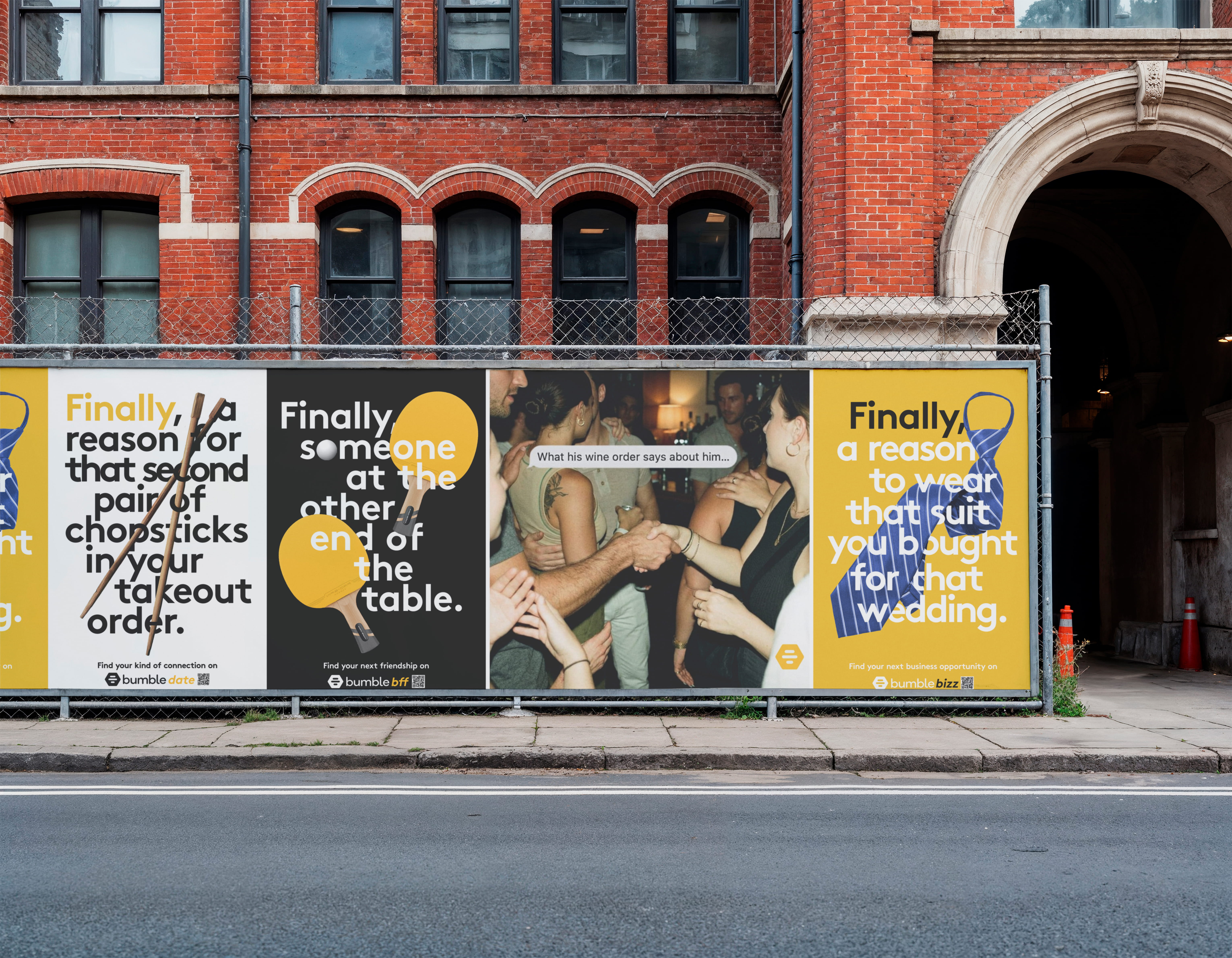
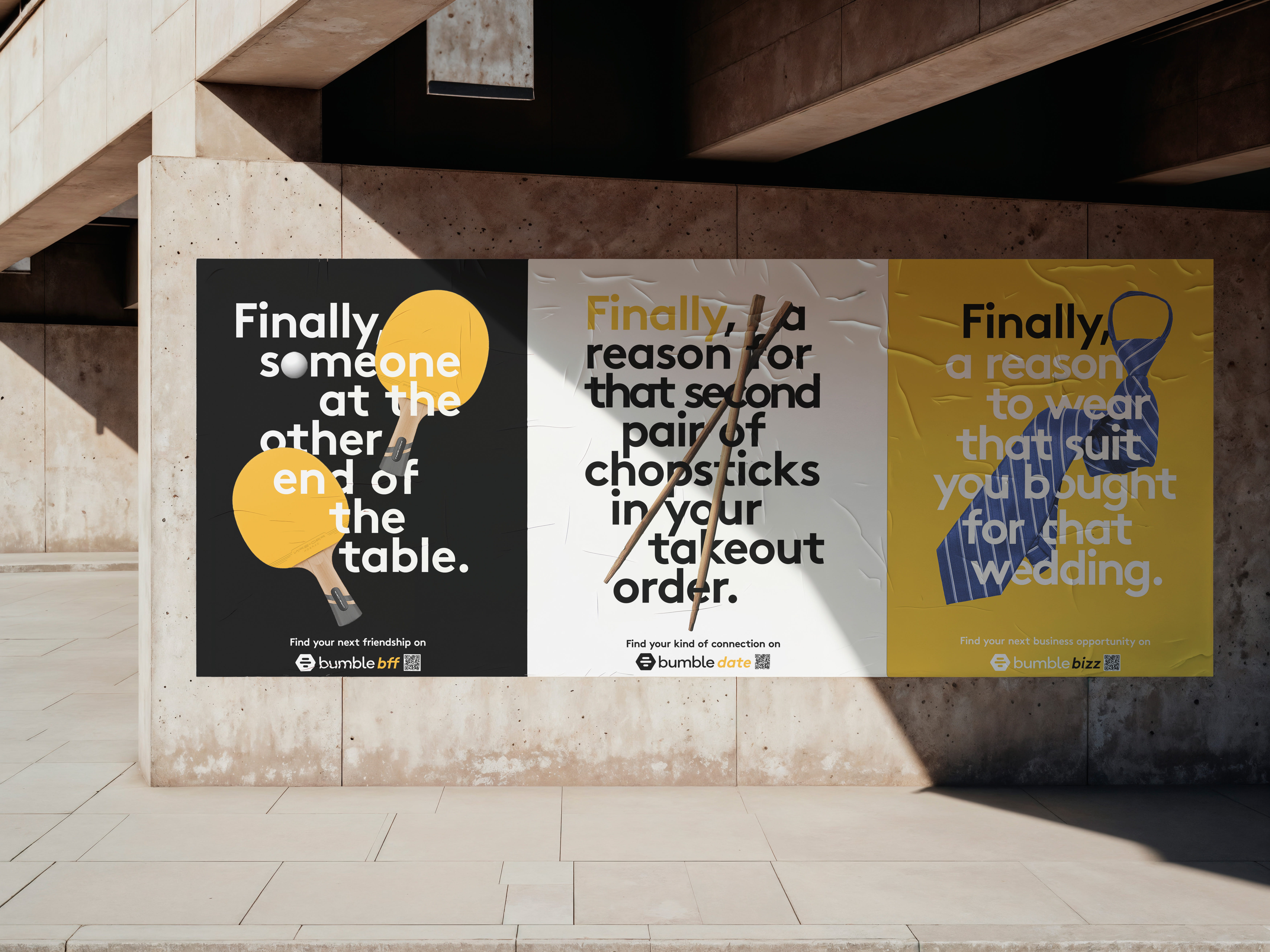
FINALLY A REASON TO ...
the process
From the beginning, this project was about people. Before thinking about visuals, we focused on understanding each section — not just what they did, but how they thought and what they needed. Walking through the user journey helped us see the experience from each client’s perspective and design with intention rather than assumption. That mindset shaped the visual direction. Instead of relying on familiar app imagery, we chose symbolic objects paired with bold typography — simple, but thoughtful. The idea was sparked by a small observation: when ordering sushi, there’s often an extra pair of chopsticks included, quietly anticipating someone else. That subtle gesture of inclusion became a metaphor for designing with connection in mind.

the solution
We began with people like Axel and Olivia — different in identity and ambition, yet connected by the same quiet sense of something missing. Understanding that feeling shaped the message into something more personal and open-ended: “Finally someone to…” — a line that leaves space for whatever connection means to you.
From there, subtle symbols — chopsticks, a suit and tie, a tandem bike — were woven into bold, optimistic typography. Together, they create a cohesive and human visual language that feels less like a campaign and more like an invitation to share what matters most.
works
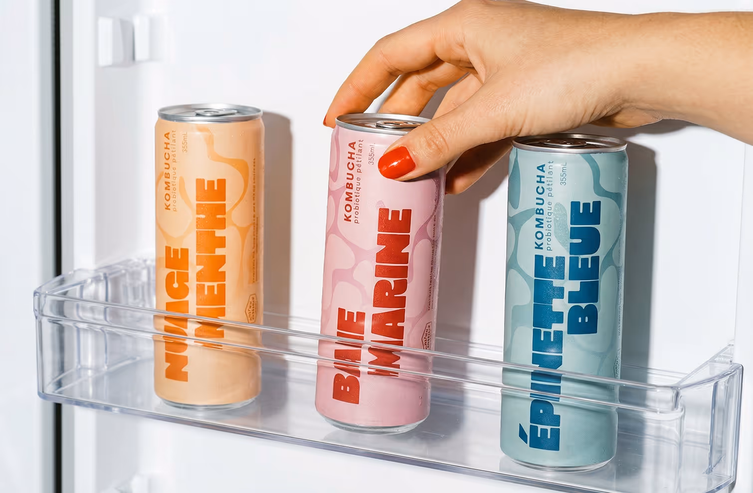
mpm kombucha
packaging for marche publique de montreal
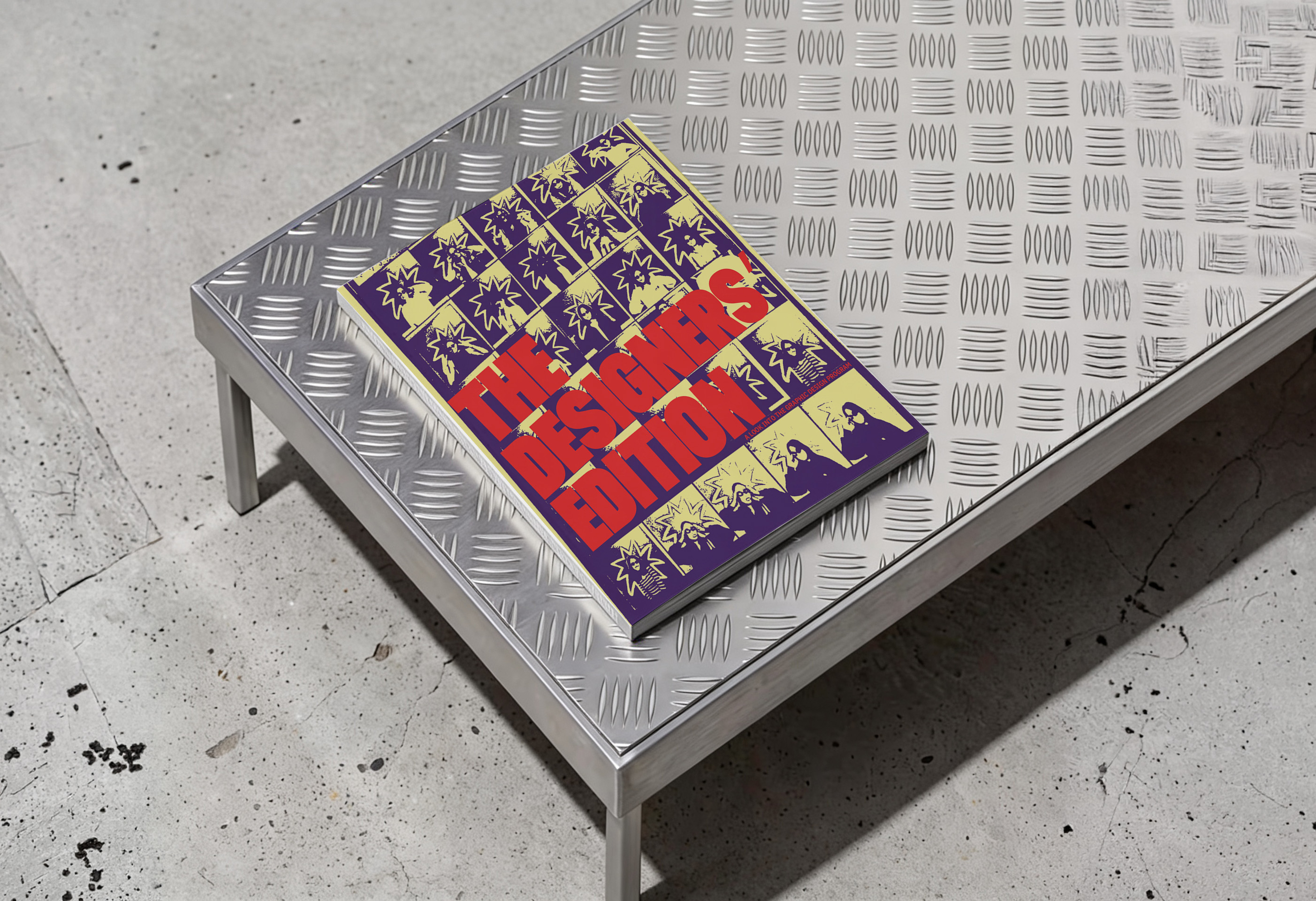
gd booklet
PROMOTIONAL BOOKLET FOR THE GRAPHIC DESIGN PROGRAM
bumble campaigne
Advertising campaign for the Bumble dating app
vernissage poster
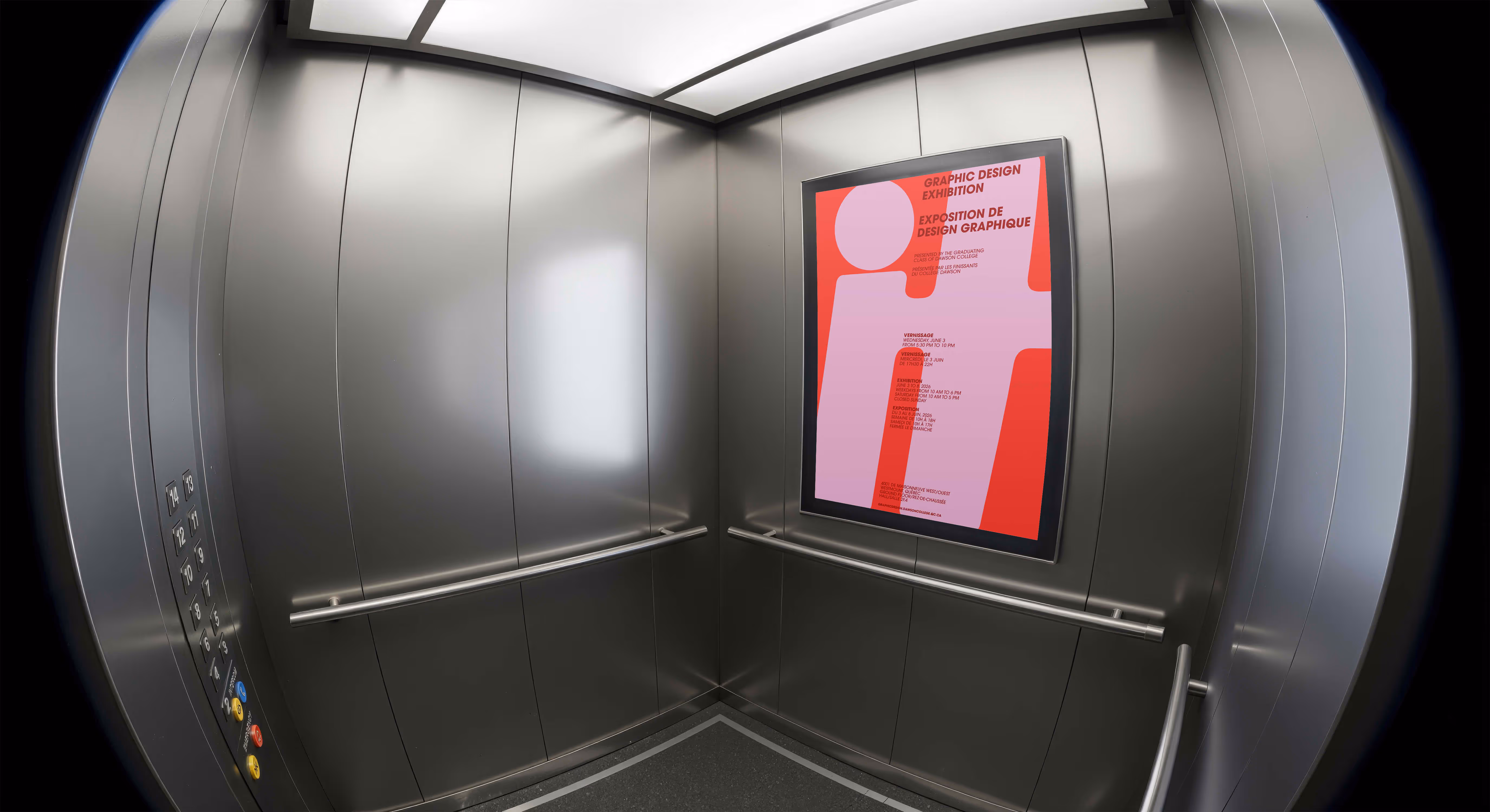
POSTER COMPETITION FOR THE THEME OF THE DAWSON GRAPHIC DESIGN VERNISSAGE
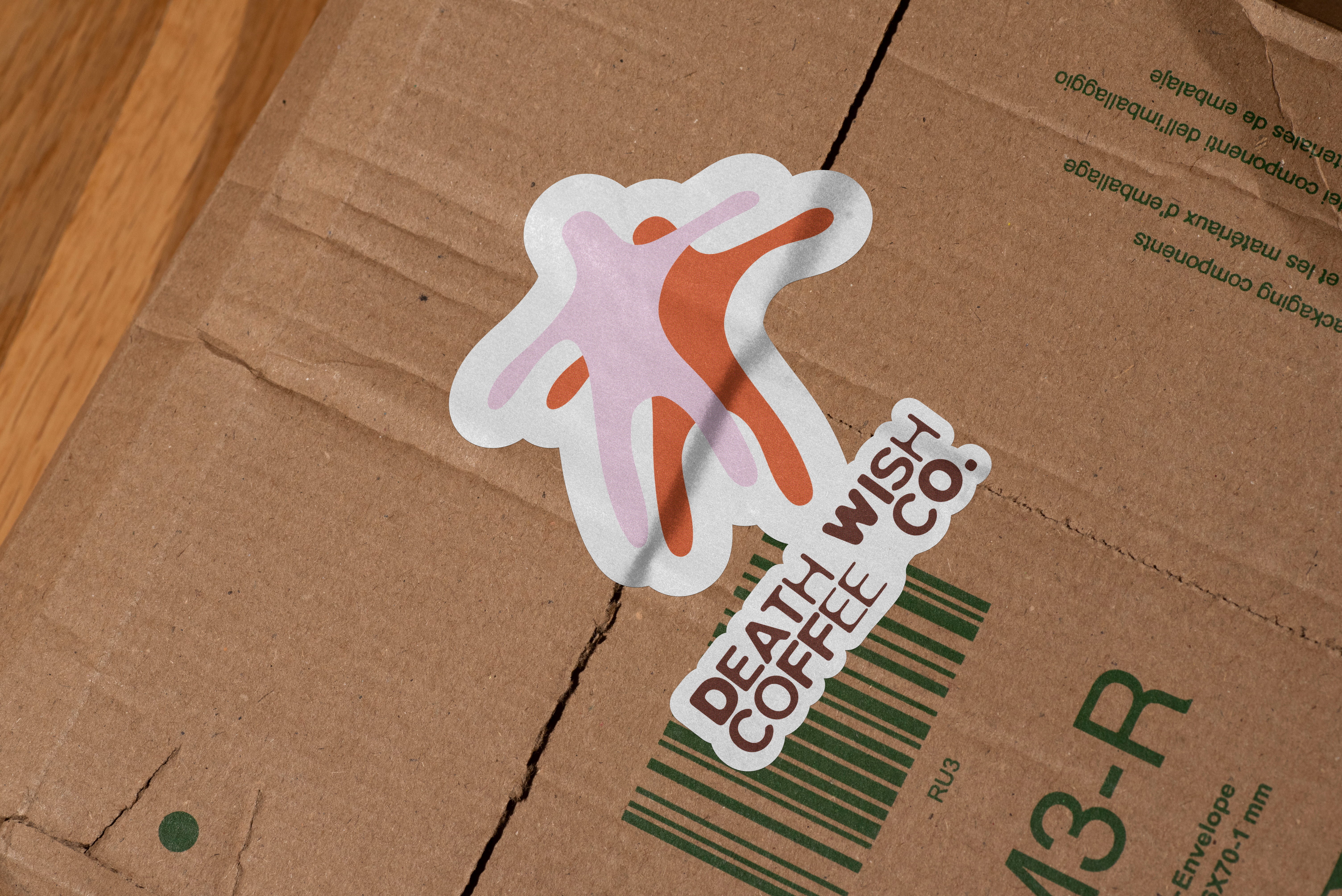
death wish coffee
REBRAND WITH APPLICATIONS FOR THE COFFEE BRAND